What Are Core Web Vitals and Why They Matter for Your Website’s Success

How do you measure your website’s success? Is it user experience? Web traffic? User engagement and conversions? Speed and stability? Or all of the above and more? Recent studies show that 53% of mobile users abandon a site if it takes more than 3 seconds to load, which can cause potential conversions and revenue to take a hit. As of 2025, Google’s Core Web Vitals are central to ranking websites and are now part of the equation for standing out online. Google introduced Core Web Vitals, or CWVs, as tools to measure real-world performance, page experience, interactivity, and visual stability of websites. Knowing and understanding what these metrics offer and how to utilize them to enhance your website’s performance is essential for delivering an optimized digital experience. With the help of these metrics, developers and organizations can have a better understanding of how users interact with their websites. What Are Google’s Core Web Vitals? Core Web Vitals are a set of performance metrics from Google. They show how fast your page loads, how soon users can interact, and how stable your layout feels while the page is loading. If your site loads slowly, buttons jump as ads pop in, or taps don’t seem to “register”, you could be driving users away, even before they see your content. LCP (Largest Contentful Paint): This measures how long it takes for the largest part of your page (like a big image or text block) to show up. A good LCP score is under 2.5 seconds. For instance, if your homepage has a hero image, LCP tracks how quickly it appears. Websites with oversized, uncompressed images can see LCP soar to over 4 seconds. Switching to WebP images or using a CDN (Content Delivery Network) can significantly reduce that time. CLS (Cumulative Layout Shift): This shows how much the page layout jumps around or shifts while loading. A good CLS score is under 0.1. Ever tried to click a “Checkout” button, but the button suddenly shifted as an ad loaded? That’s CLS in action. Prevent these jumps by always setting width and height attributes on images and ad containers. INP (Interaction to Next Paint): This tells you how fast your page reacts when users click or tap. INP should be under 200 milliseconds for a good score. Menus that lag, slow toggles, or animation delays are all signs of a high INP. Optimizing JavaScript and using fewer third-party scripts can help improve responsiveness. Core Web Vitals Thresholds Metric Good Needs Improvement Poor LCP ≤ 2.5s 2.5-4.0s > 4.0s CLS ≤ 0.1 0.1-0.25 > 0.25 INP ≤ 200ms 200-500ms > 500ms This chart displays the Google-recommended thresholds for Core Web Vitals. Scores at or below the boundary for “good” indicate an optimized user experience, while higher values signal areas needing improvements. Actual results may vary by page, device, and user network conditions. These benchmarks help guide initial optimization, but ongoing monitoring and real-world testing are essential for sustained performance. Why Core Web Vitals Are Important? Core Web Vitals matter because they show what real users feel when visiting your site. Google uses CWVs in its search ranking algorithms, so failing to meet these standards can actually drop your site’s position. But more importantly, CWVs correlate with users staying longer, buying more, and being less likely to “bounce”. A 0.1s decrease in site speed can boost conversions by 8% for e-commerce sites. This correlation between site speed and revenue highlights the importance of site optimization to improve user experiences and increase sales. Making speed and stability important for your business, not just simple checkboxes to check off. How to Check Core Web Vitals? There are many tools to check your Core Web Vitals, like Google PageSpeed Insights, Search Console, Lighthouse, and Chrome UX Report. Beyond these tools, Search Console’s Core Web Vitals report displays real user data, while lab tools such as Lighthouse give you controlled test results. Real User Monitoring (RUM) tools, like Dynatrace or Clibre, can provide ongoing performance tracking at scale. Automation tools like NitroPack, Cloudflare, or WP Rocket can streamline these checks and improvements for WordPress and other CMS platforms. How to Fix Core Web Vitals Issues? To improve LCP: Optimize images, use a CDN, and preload fonts. Implement server-side caching and critical CSS for faster initial load times. To improve CLS: Set size attributes and avoid content shifts. Anchor space for ad slots, dynamic banners, or iframes so they never “pop in” later and shift content around. To improve INP: Reduce JavaScript and third-party scripts. Deferring non-critical JS, breaking large scripts into smaller modules, and removing unused code all help minimize delay. How to Pass Core Web Vitals Assessment? To pass, your pages must meet the good threshold for all three metrics. At least 75% of visits must have good scores on LCP, CLS, and INP. This means merely optimizing for a handful of top pages isn’t enough; sitewide improvements are necessary for a consistent user experience. Real Examples Some sites improved their scores by compressing images and removing unused code. NitroPack reported an 86% pass rate using their optimization tools. In our experience at Gray Coyote Digital, implementing even just two or three targeted fixes, like optimizing font delivery and minimizing third-party tags, can move most websites into the “passing” range for all three Core Web Vitals. FAQs Q: What if my site has low traffic? A: Use lab tools like Lighthouse to test locally. Q: Is Lighthouse the same as field data? A: No. Lighthouse is lab data. Google uses field data for rankings. Q: Do Core Web Vitals only matter for mobile? A: No, but Google uses mobile-first indexing, so your mobile scores can impact rankings even more. Mobile-optimized performance benefits all users. Q: How often should I check Core Web Vitals? A: Regularly. Use Google Search Console and PageSpeed Insights monthly to catch new issues before they impact rankings. Q: Can third-party scripts hurt my score? A: Yes, too many third-party scripts slow down interactivity and
What Is a Storyboard in Web Design? A Simple Guide to Planning Better Websites
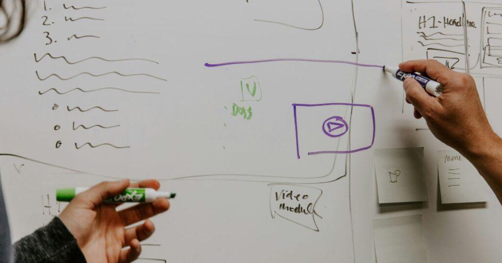
Planning a website is like planning a movie. You need to know the story before you build the scenes. That is where a storyboard helps. In web design, a storyboard helps you visualize the steps a visitor takes on your website. It helps you plan the user’s journey before you start designing, from the moment they land on your website to the moment they take the action you’ve designed for them. At Gray Coyote Digital, a Houston-based agency serving clients across the U.S., we rely on storyboards to create user experiences that feel intuitive, polished, and purposeful. Let’s take a closer look at how storyboards work and how you can create one for your next project. What Is a Storyboard in Web Design? A storyboard is a set of simple sketches or frames that map out each step a user takes on your website. It tells the story of how someone will use and interact with your site, from start to finish. Just like in movies, each frame of the storyboard shows what the users see, what they click, and what happens next. You can hand-draw these steps with a pen and paper or use design tools. What matters most is mapping out the user’s path before any real design begins. Some key elements of a web storyboard: Frames/panels to illustrate each page or screen state. Arrows show navigation paths and decision points. Notes that describe interactions, copy, or functionality. Why Use a Storyboard for Websites? There are many good reasons why a storyboard matters in web design: It helps you plan your website before you build it. It visualizes how people will move from one page to another. It reveals problems early, like dead ends, endless loops, or needless steps. It makes collaborating with your team easier to share ideas. It saves time and money during the design phase. Ultimately, a well-crafted storyboard becomes your project’s guide for shaping decisions, aligning teams, and ensuring your website delivers the experience users expect. It brings clarity and direction to your web project, long before any pixels hit the screen, making it easier to design with purpose and build with confidence. Storyboard vs Wireframe: What’s the Difference? Some people mix up storyboards and wireframes. Both are tools that help you plan, but they are not the same. A storyboard focuses on the steps a user takes. It tells the story. A wireframe focuses on the layout and visual hierarchy. It maps what the site looks like. It is best to use a storyboard first, nailing down the user’s journey. Then, you can move to wireframes once the direction is clear. When Should You Use a Storyboard? You should use a storyboard at the very beginning of your project. It is most helpful during the planning stage, especially: Outlining a direction before starting any design processes When mapping out key user experiences and core functionalities Helping guide wireframes and mockup creation A well-crafted storyboard keeps everyone aligned and makes the whole process easier and smoother. How to Create a Storyboard for Web Design You don’t need to be an artist to create a storyboard. Follow these simple steps: 1. Define Your Goals What do you want users to do on your site? What actions should they take? Do you want them to book a call, buy a product, or fill out a form? Start there. 2. Know Your Audience Think about who is using your site. Create user profiles or personas. What do they need? What problems are they trying to solve? 3. Break down the Journey List each major step the user takes. For example: They land on your homepage They click “Services.” They read about your offer They fill out a form 4. Sketch Each Frame Draw one frame for each step. It doesn’t need to be anything fancy; even stick figures and boxes will work. Use arrows to show how users move from one frame to the next. 5. Add Notes Write short notes next to each frame. Describe interactions and explain what happens on each page or screen. 6. Review and Update Share your storyboard with your team, gather feedback, and refine until the flow feels smooth. Tools You Can Use Whether you prefer analog or digital, pick a tool that fits your workflow: Pen and paper Figma Adobe XD Miro StoryboardThat Pick the one that works best for you and your team. Example of a Website Storyboard Let’s say you own a small bakery and your goal is to get online orders. Your storyboard might look like this: Homepage frame: Hero image/banner with a “Shop Now” button. Product list frame: Grid of product thumbnails with prices. Product detail frame: Photos, description, quantity selector, “Add to Cart”. Cart frame: Order summary and “Checkout” button. Checkout frame: Address and payment form, “Purchase” button. Confirmation frame: Thank you message and order confirmation number. Each step is a simple drawing with notes about what the user sees or clicks. It shows the full journey from start to finish. Tips for Better Storyboards Here are a few extra tips for making better storyboards: Keep it simple: It doesn’t have to look pretty, as long as it conveys the user’s journey. Focus on the user journey: Make sure you understand what the user’s end goal will be, from start to finish. Show decision points: Include alternative paths, and understand that not all users are the same. Get feedback early: Run internal review sessions to make sure everyone is on board and to help find any weak points. Update your storyboard as things change: As feedback comes in or requirements change, make sure to update the storyboard accordingly. A well-crafted storyboard lays the foundation for a website that feels intuitive and meets business goals and user expectations. They are a great first step in the web design and development processes. At Gray Coyote Digital, we guide clients through the process to ensure clarity, alignment, and efficiency from day one. Ready to plan a website
Website Development for Dentists

Custom dental websites that attract more patients First Impressions Matter Did you know that 77% of people look online before choosing a dentist? That means your website is often the first thing they see. If it appears outdated or does not function properly, people may leave and never return. 88% of visitors will not return after a poor website experience. At Gray Coyote Digital, we help dentists build modern, easy-to-use websites that make people feel welcome and ready to book. We are a Houston-based web design agency, but we work remotely, so we can help dental practices in any city across the U.S. or even worldwide. Why Dentists Need a Great Website Having a website is not enough. You need one that works hard for your dental practice every day. Here’s why: 75% of users judge your practice by how your website looks. When your site looks professional and works well, new patients feel safe choosing you for their care. A clean and easy design builds trust right away. By simplifying navigation and presenting information clearly, visitors instantly know you value their time and comfort. Most people search on their phones, so your site needs to work on all screen sizes. 60% of patients expect websites to work well on mobile. A helpful site makes it easier for patients to book appointments online. Integrated booking forms and clear calls-to-action let patients schedule visits in seconds, optimizing your scheduling and lowering the rate of missed appointments. A professional website builds confidence in your services. It also helps you stand out from other dentists in your area. Features Every Dental Website Should Have We design websites that not only look great but also work well and drive results. Here are the features we include: Online appointment booking that lets patients reserve a time instantly. Fast-loading pages that work on mobile and desktop so visitors never bounce out of frustration. Patient reviews and before/after galleries to showcase your real results and build patient confidence. Simple, HIPAA-compliant contact forms for secure inquiries and peace of mind. SEO-friendly content to boose your rankings and help new patients find you on Google. Clear and concise service pages that explain treatments in plain language and guide users to book. A design that matches your brand and clinic’s personality, setting you apart from competitors. Custom vs. Template: Why Custom Wins Many website builders rely on one-size-fits-all, cookie-cutter templates. While these can look okay, they are often slow, limit your ability to adapt and customize, and fail to showcase your unique brand. A fully custom website, by contrast, gives you: A tailor-made design that reflects your clinic’s personality and makes you memorable. Optimized performance and speed so visitors stay engaged rather than bouncing. Room to grow as your dental practice grows, adding new services, features, or locations. Advanced SEO features for better online rankings to help you outrank competitors and attract more patients. A custom site can instantly elevate your practice’s credibility. Users will see professionalism and trustworthiness the moment they land on your homepage. Why Choose Gray Coyote Digital? We have worked with many service-based businesses, including medical and dental clinics. Our process is simple and stress-free. We listen to your needs and build a site that helps your practice grow. We are based in Houston, Texas We work remotely with dentists across the U.S. We offer custom solutions built just for your clinic You get full support before, during, and after the project Let’s Build a Site That Works for You Are you ready to have a dental website that looks great, loads fast, functions well, and helps you bring in new patients? Let’s talk. Ashton Patel Founder & Full Stack Web Developer Previous PostNext Post
Custom Web Design for Restaurants That Brings More Customers

Today’s diners expect more than a menu PDF and generic photos; they want an immersive, on-brand experience from the moment they land on your site. At Gray Coyote Digital, we specialize in custom web design for restaurants, crafting every page, interaction, and integration to turn casual browsers into loyal guests. Whether you’re in Houston or anywhere in the U.S., our remote team will design a site that looks great, loads lightning-fast, and drives real bookings and orders. Why Custom Web Design Is Essential for Restaurants Every restaurant has its own story, style, and service model, and your website should reflect that uniqueness. A custom-built site: Showcases Your Brand Voice & AestheticTemplates can feel generic. We start from scratch to match your color palette, typography, and personality, so visitors immediately feel your vibe, not someone else’s. Optimizes User ExperienceFrom the layout of your menus to the booking widget placement, we design around how diners search, browse, and convert, making every click intuitive and frictionless. Supports All Revenue StreamsReservations, online orders, loyalty sign-ups, merchandise, or event bookings, your site will be set up to promote and process each offering seamlessly. Core Elements of a High-Converting Restaurant Website Engage Guests from First Click Before design begins, we map out every way customers interact with your brand, meaning reservations, takeout, loyalty, newsletter sign-ups, events, and merch. Then, those focal points will be built into the site’s structure and navigation. Integrations That Feel Native Most restaurants rely on third-party platforms for reservations or orders. We custom-style those widgets/plugins to load within your design framework, including logos, colors, and fonts, ensuring diners never feel like they’ve left your site. Data-Driven Insights Built In Your website is your digital front door. We integrate analytics, plus reservation and ordering data, to collect guest preferences, including dietary needs, booking frequency, and event attendance, all to help targeted marketing and menu improvements. Local SEO to Fill Tables A beautiful site doesn’t matter if no one sees it. We optimize on-page elements and link your Google Business Profile so local searchers find you first when they type “Thai restaurant near me” or “best rooftop dining in Houston.” Clean, Action-Oriented Content Visitors shouldn’t hunt for critical details. We highlight your value propositions (dog-friendly, live music, chef’s tasting menus) with concise, descriptive copy and compelling imagery, so guests immediately know what sets you apart. Dynamic, Accessible Menus Static PDFs frustrate both diners and search engines. We implement text-based, mobile-friendly menus that you can update instantly. This ensures screen-reader compatibility, faster load times, and up-to-the-minute accuracy on pricing and specials. Scalable, Future-Proof Architecture As your restaurant evolves, like adding cooking classes, catering, merch bundles, or virtual events, your website will be ready. We build on a flexible CMS, enabling you to launch new landing pages, ticketed events, or loyalty perks without a full redesign. Our Custom Restaurant Web Design Process Discovery & StrategyWe learn your brand story, offerings, and guest journey. Together, we define key engagement points and revenue drivers. Wireframes & PrototypingInitial layouts show where menus, galleries, booking widgets, and CTAs will live, ensuring user experience flows naturally. Visual Design & BrandingWe craft a pixel-perfect mockup that captures your restaurant’s ambiance, including colors, imagery, typography, and tone. Development & IntegrationWe’ll develop designs into a responsive, fast-loading website. We seamlessly embed reservation and ordering systems, analytics, and any custom features. Testing & LaunchWe QA across devices and browsers, optimize performance, and ensure SEO best practices are in place when it’s time to launch. Training & Ongoing SupportYou’ll have full control to update menus, photos, and content anytime. And our team remains on hand for updates, new features, or seasonal promotions. Want to see a sample of our work? Take a look at our Tea Shop Demo to get a feel for how your site could look. This is just one example of a clean, modern layout built for food and drink businesses. Why Work With Gray Coyote Digital? Many companies offer restaurant websites, but here’s what makes us different: we’re a Houston-based web agency with nationwide reach, combining local care and remote efficiency so we can build your site no matter where your restaurant is located. At Gray Coyote Digital, we blend deep restaurant-industry know-how with fast, friendly service, so your new or existing site not only looks great but fills tables. Whether you’re launching a cafe, expanding to new locations, or updating your seasonal menu, we’ve got the expertise and the processes to get you online quickly and keep you growing. Houston Roots, National Reach: Local care and remote efficiency, wherever you are, we’re on your team. Quick Turnarounds: We deliver fully custom, mobile-ready websites without compromising quality. Always Here When You Need Us: We’re easy to reach and quick to respond whenever you have a question or need an update. Easy Self-Management and Scalable Support: We use simple tools that allow you to keep your website up to date with little hassle. Transparent, Metrics-Driven: Clear milestones and open communication plus ongoing analytics support, so you see exactly how your site fills seats and boosts orders. FAQs About Restaurant Websites How long does it take to build my website?Most sites can take 2 to 4 weeks, depending on what features you need and the design. Can I update my menu on my own?Yes! We make sure that your site is easy to use and update, so that you can make changes anytime. If you have any trouble making updates, we will provide detailed documentation, or you can reach out to us, and we’ll take care of it for you. Will my site work well on phones?Yes. All our websites are designed and built to be mobile-friendly and fast. Do you offer support after the site is launched?Yes. We offer ongoing support and maintenance if you ever need changes or updates on your website. Ready to bring More Guests to Your Table? A custom website is one of the most powerful investments your restaurant can make, because it’s open 24/7, drives direct bookings,
Web Design for Plastic Surgeons

Custom web design for plastic surgeons, reconstructive surgeons & cosmetic surgeons Imagine a website that doesn’t just impress potential patients but turns their curiosity into booked appointments. Your website is the digital front door for people considering plastic surgery, it’s where first impressions are made. To stand out, it must look polished, load lightning-fast, and perform flawlessly across all devices. At Gray Coyote Digital, we specialize in crafting websites that drive real results by converting visitors into loyal patients. We’re more than just a web agency, we’re your partners in building a standout online presence. Based in Houston, Texas, our remote team brings tailored web solutions to plastic surgeons anywhere in the United States or even globally. Wherever you are, we’re here to create a website that reflects your unique expertise and attracts the patients you want. How a Quality Website Helps Your Plastic Surgery Practice Most people search online before choosing a plastic surgeon. They want to feel safe, informed, and confident before making a decision. Your website is often the first place they go to learn about you, your services, and your results. A strong website helps you: Build trust by showing before-and-after photos and patient reviews Show professionalism with clean design and clear messaging Make it easy for people to book a consultation or ask questions Stand out from other surgeons in your area Work on all devices so patients can view your site from their phones or computers When your website is easy to use, loads fast, and looks great, people are more likely to choose your practice. That is why a strong, modern website is one of the best tools you can have to grow your business. Here are some facts that show why good design is so important: 75% of people judge your credibility based on your website 88% of visitors are less likely to return after a bad experience 61% have a higher opinion of companies with good mobile sites 38% will leave a website if it looks bad or is hard to use If your website is slow, confusing, or hard to use on phones, you could be losing patients without knowing it. What You Get With Our Plastic Surgery Web Design We build websites that help your practice grow. Our websites are made to look clean and modern while staying easy for your patients to use. Here is what we include: Mobile-Friendly Design: Your site will look great on phones, tablets, and computers Fast Load Speed: Patients will not wait more than a few seconds for a site to load Photo Galleries: Show before-and-after results in a clear and professional way Online Forms: Make it easy for people to contact you or book a consultation Built In SEO: Your site will include the keywords people use to search for your services Simple Blog Setup: You can share news, tips, and info to help your site rank higher on Google Built With Marketing in Mind We do not just build pretty websites. We build websites that help your practice grow. We include: Local SEO Setup: So people near you can find your services Service Page Optimization: Pages for your top procedures like breast augmentation, rhinoplasty, and tummy tucks Google Maps Integration: To help people get directions easily Content Support: We can help write or edit your website content if you need it Why Plastic Surgeons Choose Gray Coyote Digital You need a team that understands both design and patient needs. At Gray Coyote Digital, we’ve worked with medical professionals and clinics across different cities. We know what it takes to build a clean, clear, and effective website for a plastic surgery practice. We’re based in Houston, Texas We work fully remote and serve clients anywhere in the U.S. or worldwide We offer friendly support and fast response times We keep things simple and easy to understand We help your website look amazing and rank well too Common Questions How long does it take to finish my website?Most websites take between 3 to 5 weeks, depending on your content and features. Can you update my current website?Yes, we can rebuild or improve your current site to match today’s design standards. Do you help with logos or branding?Yes, we can help you with logo design, colors, and overall brand style if needed. Will my website be HIPAA-compliant?We include secure forms and can help make sure your contact setup follows best practices. Ready to Grow Your Practice? If your current website does not bring in patients or if you do not have a site yet, now is the time to act. A well-designed website helps you build trust, grow your practice, and stand out from other plastic surgeons in your area. Let Gray Coyote Digital help you create a website that works for you. Contact us today for a free consultation. Ashton Patel Founder & Full Stack Web Developer Previous Post
Web Design for Psychologists

Custom web design for psychologists, psychiatrists, and treatment centers Are you a psychologist or therapist looking for a website that builds trust and brings in new clients? At Gray Coyote Digital, we design websites just for mental health professionals. Whether you are starting your private practice or growing your team, we help you create a calm, secure, and easy-to-use website that speaks to your clients. We are a Houston-based web design agency that works with therapists across the U.S. and worldwide. Our team works fully remote, so no matter where you are, we can help. Why Psychologists Need a Strong Website Today, many people search online to find a therapist. This means your website is often the first place someone will learn about you. A good website helps people feel safe, seen, and ready to reach out. It should be: Simple and calming Easy to navigate Clear about your services Private and secure Your website is more than a page. It is a tool to grow your practice and connect with the people who need you. First Impressions Matter – Your Website Can Make or Break It Did you know that 88% of people won’t come back to a website after a bad experience? That means your design matters more than ever. When someone visits your site, they decide quickly if they can trust you. In fact, 75% of people say they judge a business’s credibility based on how the website looks. If it feels outdated or confusing, they may move on before reading a single word. Also, with more people using phones to find help, your site must work well on mobile. 61% of visitors say they think more highly of companies with a good mobile experience. On the other hand, 38% of users will leave if your site’s layout or content isn’t clear or attractive. What Makes a Great Therapy Website? We know what works for therapists and psychologists. Here are a few things every therapy site needs: A calming design that reflects your style and values Fast loading times to keep people engaged Secure contact forms to protect client privacy Online booking tools to save you time Mobile-friendly layout so your site looks good everywhere Local SEO so clients can find you in your area We build websites with all of this in mind. Every part is made to help you connect with the right people. Our Custom Web Design Services for Psychologists At Gray Coyote Digital, we don’t believe in one-size-fits-all. We create websites tailored to your goals and your practice. Here’s what we offer: Custom therapist branding and logo design Mobile-ready design for all devices Easy-to-update websites with built-in SEO HIPAA-compliant setup with secure hosting Intake forms and booking systems Blog or resource pages to share helpful info Whether you need a brand-new site or want to refresh an old one, we are here to help. We Focus on Privacy and Compliance As a psychologist, you must protect your clients’ privacy. That is why we make sure your site is built with security in mind. SSL certificate on every site HIPAA-friendly contact forms Privacy policy and cookie notices Secure hosting platforms We guide you through these steps so you feel confident in your website’s safety. Why Choose Gray Coyote Digital? We know how important your work is. That is why we listen carefully, explain things in simple terms, and build with care. We have experience designing for therapists We are always easy to reach and happy to help We stay up to date with web trends and best practices We deliver clean, modern websites that are easy to manage Based in Houston, Texas, we work with psychologists in any city or country. From solo therapists to growing mental health clinics, we’re ready to support your journey. Let’s Build a Website That Builds Trust Your website should feel like a safe space. Let’s work together to create something you are proud of. Ready to get started? Book a free consultation today and see how we can help you grow your practice. Ashton Patel Founder & Full Stack Web Developer Previous PostNext Post
Web Development Basics

Every website you visit is built with something called web development. But what does that mean? Web development is the work behind creating a website, including its design, functionality, and security. At Gray Coyote Digital, we believe it is important for business owners like you to understand how websites work. When you know the basics, you can feel more confident about your site and how it supports your business. In this guide, we will explain web development basics in simple terms. You will learn what goes into making a website, why it matters, and how good development helps your business grow. What Is Web Development? Web development is the process of building a website and making sure it works properly. It is not about how the site looks (that is web design). Instead, web development focuses on how the site works behind the scenes. Think of a website like a car. The design is the paint color and shape. The development is the engine, the wheels, and everything that makes it run. Both are important, but today, we are going to look under the hood. Front-End vs Back-End Development When building a website, there are two main parts: 1. Front-End Development This is everything you see and interact with on a website. It includes buttons, images, menus, and text. The front end is also called the client-side because it runs in your web browser. For example, when you click on a “Contact Us” button or read a blog post, that is the front end working. 2. Back-End Development This is the part of the website you do not see. It handles things like storing data, processing orders, or sending emails. The back end is also called the server-side because it runs on the website’s server. For example, when you fill out a form and it sends your message to the business, that is the back end at work. Both front-end and back-end development are needed to create a fully working website. Together, they make sure your site looks great and works smoothly. Essential Web Technologies Websites are built using a few key tools. Let’s break them down: HTML (HyperText Markup Language) – This is the basic structure of every web page. It tells the browser what content to show, like text or images. CSS (Cascading Style Sheets) – This controls how the website looks. It handles colors, fonts, and layout, making the site visually appealing. JavaScript – This adds interactivity to a website. It makes things move, pop up, or respond when you click. All three work together. First, HTML builds the house, CSS paints and decorates it, and JavaScript adds the lights and moving parts. Introduction to Web Frameworks As websites get more complex, developers use frameworks to build them faster and better. A framework is like a set of building blocks that helps developers avoid starting from scratch every time. Some popular frameworks include: React – Great for interactive websites and apps Angular – Often used for larger, more complex sites Vue – Simple and flexible for many projects At Gray Coyote Digital, we choose the right tools for each project, making sure your website is built to fit your needs. APIs and Databases Websites also need to share and store information. That is where APIs and databases come in. API (Application Programming Interface) – This allows your website to talk to other programs. For example, when you show a map from Google on your site, an API makes that happen. Database – This is where information is stored, like customer details, product listings, or blog posts. The website pulls data from the database and shows it on the front end. These tools help your website stay connected and keep important data organized. Why Web Development Matters for Your Business Good web development is not just for tech experts. It plays a big role in your business success. Here’s why: Speed – A well-built website loads fast. Visitors will not wait for a slow site. Security – Strong development keeps your site safe from hackers. Mobile-Friendly – Good code makes sure your site works on phones and tablets. SEO (Search Engine Optimization) – Google likes websites that are built well. Clean, fast code helps your site show up in search results. When you invest in proper development, you are investing in your business’s future. A strong, smooth-running site keeps visitors happy and helps your brand grow. Learn more about how design and SEO work together on our SEO and Web Design page. Final Thoughts Now that you know the basics of web development, you can feel more confident when working on your website. Understanding how a website works, helps you make better choices for your business. At Gray Coyote Digital, we specialize in both web design and development. We build websites that not only look great but also perform at their best. From simple sites to complex systems, we make sure everything runs smoothly. Ready to build or upgrade your website? Contact us today or explore our full Web Development Services to get started. Ashton Patel Founder & Full Stack Web Developer Previous Post
Web Design Fundamentals
Web design is how websites are made to look and feel. When done right, it helps people find what they need, trust your brand, and enjoy using your site. At Gray Coyote Digital, we believe that every website should be easy to use and nice to look at. That’s why we follow simple, smart design steps to build websites that work. In this guide, you’ll learn the basics of web design and why it matters for your business. Learn more about our full approach on our Web Design and Development page. What Is Web Design? Web design is the process of planning and creating the way a website looks. It includes things like layout, colors, text, images, and how everything fits together. While web development focuses on how a site works, web design focuses on how it looks and how people interact with it. So, if you want a site that people enjoy using, you need both design and development. A good design makes everything feel smooth and clear. What’s the Difference Between UI and UX? You might hear the words UI and UX. Let’s break them down. UI stands for User Interface. This is how the website looks. It includes buttons, menus, colors, and fonts. UX stands for User Experience. This is how the website feels. Is it easy to use? Can people find what they need quickly? For example, if a button is in the right spot and easy to click, that’s good UI. If the whole website feels simple and smooth, that’s good UX. Both are important, and they work best when used together. Key Principles of Good Web Design When building a website, there are a few key rules to follow. These rules help make your site clear, fast, and friendly to visitors. 1. Keep it Simple Too much stuff can confuse people. So, it’s better to keep things clean and clear. 2. Be Consistent Use the same colors, fonts, and styles across every page. This helps people feel at home as they move around your site. 3. Use Visual Hierarchy Put the most important things at the top or in big bold text. This helps people know where to look first. 4. Make it Easy to Navigate People should be able to find what they need with just a few clicks. Clear menus and links make this happen. 5. Think Mobile-First Most people use phones to browse websites. So, your site needs to work well on small screens too. Design Elements That Matter Web design is more than picking pretty colors. Here are a few important design parts that make a big difference: Typography This means the style and size of your text. Choose fonts that are easy to read, and make sure your text is big enough on all devices. Color Colors can show your brand’s style and help people know where to click. Use colors that match and have good contrast for easy reading. Layout This is how everything is arranged on the page. Use space wisely so the page doesn’t feel crowded. Images and White Space Images can help tell your story, but you also need empty space. This white space gives your content room to breathe. Responsive vs Adaptive Design Websites need to work on all screen sizes. That’s where responsive and adaptive design come in. Responsive design means the website changes its shape to fit the screen, no matter the size. Adaptive design uses set layouts for different screen sizes. At Gray Coyote Digital, we mostly use responsive design. It’s more flexible and works better on many devices. Tools We Use for Web Design Designers use special tools to create websites. Some of the most popular are: Figma – Great for creating layouts and working with teams Adobe XD – Good for making design mockups Sketch – A favorite for many designers on Mac These tools help us plan the site before we build it. They make sure everything looks just right before we write any code. Web Design Is Not Just About Looks A nice-looking website is great, but that’s only the beginning. Your site also needs to: Load quickly Work on phones and tablets Show up on Google Help visitors take action (like calling or buying) That’s why our designs always think about speed, search engines, and user needs. We want your site to do more than sit there. We want it to help your business grow. You can learn more on our SEO and Web Design pages. Final Thoughts Web design might sound tricky at first, but it all comes down to making things simple, clear, and helpful. Whether you’re building your first website or updating an old one, the basics are always important. At Gray Coyote Digital, we build websites that work for you and your visitors. We care about design, performance, and results. Ready to get started? Contact us or learn more about our Web Design and Development Services. Ashton Patel Founder & Full Stack Web Developer Previous Post
Why Web Design Is More Important Than Ever in 2025 (And Beyond)

Your website often gives potential customers the first impression of your business. In a world where online presence can make or break success, web design is no longer just about aesthetics. Web design plays a crucial role in functionality, user experience, and business growth. A well-designed website enhances credibility, improves search engine rankings, and drives customer engagement. But what makes web design so critical, and how can businesses leverage it for maximum impact? This article explores the essential aspects of web design and why it remains a cornerstone of digital success in 2025 and beyond. 1. First Impressions Matter: The Psychology of Web Design Studies show that users form an opinion about a website in just 0.05 seconds. That first impression is largely based on visual appeal, organization, and usability. If your website looks outdated, cluttered, or hard to navigate, potential customers click away to a competitor’s website instead of exploring your offerings. Key Elements That Influence First Impressions: Visual hierarchy: How information is structured and presented Color schemes: Colors evoke emotions and influence user behavior Typography: Readable fonts enhance comprehension and trust Whitespace: Clean layouts reduce cognitive overload and increase focus Imagery and Videos: High-quality visuals create engagement and reinforce branding Interactive Elements: Motion graphics and micro-interactions keep users engaged Companies like Apple and Airbnb have mastered this psychological aspect by creating visually stunning, easy-to-navigate websites that instantly communicate professionalism and reliability. Their success isn’t accidental, it’s the result of careful attention to psychological triggers that build trust and credibility. 2. User Experience (UX): The Core of Web Design User experience has become the foundation of effective web design, transforming how businesses approach their digital presence. Web design is not just about how a site looks. It is about how it works for users. A visually stunning website might attract visitors, but it’s the user experience that keeps them engaged and converts them into customers. Elements of Great UX Design: Intuitive navigation: Menus should be simple and logical Fast loading speeds: Websites that load in under three seconds reduce bounce rates significantly Mobile optimization: Over 60% of web traffic now comes from mobile devices Accessibility: Ensuring usability for all users, including those with disabilities Content Readability: Large text blocks should be broken into smaller, digestible chunks Feedback Mechanisms: Contact forms, surveys, and chat support improve engagement Good UX design does more than enhance user satisfaction and improve engagement rates, it creates a digital journey that encourages users to stay, explore, and ultimately convert. Studies reveal that 88% of users will not return to a site with poor usability, which underlines the importance of intuitive, user-focused design in reducing bounce rates and fostering customer loyalty. 3. Web Design and SEO: A Direct Connection Web design and search engine optimization (SEO) go hand in hand. Google prioritizes user-friendly, well-structured websites when ranking search results. How Web Design Affects SEO: Mobile-friendliness: Google’s mobile-first indexing ranks mobile-optimized sites higher Page speed: Faster websites improve search rankings and reduce bounce rates Structured data: Helps search engines understand website content Clean code and metadata: Properly coded websites perform better in search engine results Internal Linking: Enhances site structure and improves discoverability Image Optimization: Proper image compression and alt text improve rankings Google’s Core Web Vitals, introduced in 2020, have become increasingly important in 2025, measuring three key aspects of user experience: Largest Contentful Paint (LCP) This measures loading performance. For optimal user experience and SEO: Pages should load within 2.5 seconds Images should be optimized Server response time should be minimal Resource loading should be prioritized First Input Delay (FID) This measures interactivity. Websites should: Respond to user input within 100 milliseconds Minimize JavaScript execution time Break up long tasks Optimize event handlers Cumulative Layout Shift (CLS) This measures visual stability. To minimize disruption: Include size attributes for images and videos Reserve space for dynamic content Use transform animations instead of properties that trigger layout changes Properly implement web fonts A well-designed website improves user experience and boosts search engine visibility, attracting more organic traffic. 4. Conversion Optimization: Turning Visitors into Customers A visually appealing site is not enough. It must also be designed to convert users into paying customers. Key Conversion Elements in Web Design: Clear Calls-to-Action (CTAs): Buttons that prompt users to take action, such as “Sign Up” or “Buy Now” Trust signals: Customer testimonials, security badges, and professional design boost credibility Minimal distractions: A streamlined layout keeps users focused on the conversion goal A/B testing: Data-driven design tweaks improve performance Lead Magnets: Free trials, ebooks, and webinars capture user interest Personalization: AI-powered recommendations increase engagement By refining these elements, businesses can significantly increase conversion rates and revenue. A study by HubSpot found that strategic CTAs increase conversions by 121%. 5. Branding and Consistency: Building a Memorable Identity Your website is a direct reflection of your brand. Consistency in design reinforces brand identity and fosters trust. Essential Branding Elements in Web Design: Memorability & Recognition: A well-branded website with consistent colors, fonts, and visuals makes your business instantly recognizable. When customers see these elements elsewhere on social media, ads, or packaging, they immediately associate them with your brand. Trust & Credibility: A polished, professional design signals reliability and expertise. Customers are more likely to trust and engage with a brand that presents itself consistently across all digital touchpoints. Emotional Connection: Thoughtful branding, including compelling storytelling and visual identity, evokes emotions that resonate with your audience. When users feel connected to your brand, they are more likely to return. User Experience & Engagement: A well-structured, visually appealing website makes it easier for users to navigate, find information, and take action. Positive experiences encourage repeat visits and brand loyalty. Competitive Advantage: In a crowded digital landscape, strong branding helps differentiate your business. A distinctive and cohesive design makes your brand stand out, ensuring customers remember and choose you over competitors. By integrating these branding principles into your website, you create a lasting impression that not only attracts customers but also keeps them coming back. 6.
How to Make a Website: A Comprehensive Beginner’s Guide
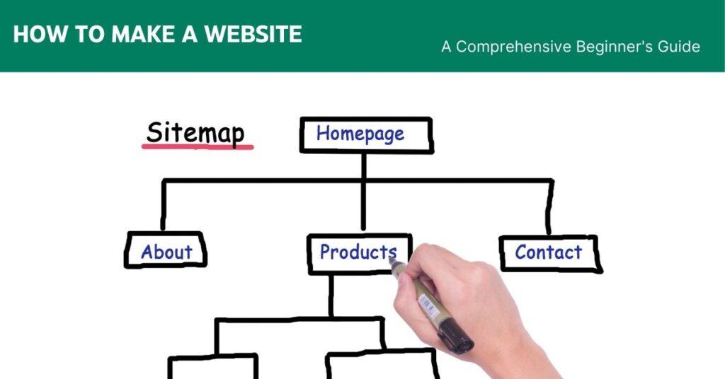
Creating a website might seem like a complex technical challenge, but anyone can bring their digital vision to life with the right approach and guidance. Whether you’re a small business owner, freelancer, blogger, or enthusiast, this comprehensive guide will walk you through every step of website creation. 1. Planning Your Website: Setting the Foundation The journey of creating a successful website begins with careful planning. Before diving into design and development, you need a clear roadmap that defines your website’s purpose, audience, and goals. Define Your Website’s PurposeEvery great website starts with a clear purpose. Defining the purpose will shape every decision you make moving forward. Understanding the core objective of your website is crucial. Ask yourself: What do I want to achieve? Who am I trying to reach? What problem am I solving? Your purpose could vary widely: Showcasing a portfolio Selling products online Sharing personal blog posts Providing professional services Creating an informational resource Building an online community Identify Your Target AudienceKnowing your audience is crucial. A well-defined audience ensures your content and design resonate effectively. Understanding your audience helps you design a website that resonates with them. Consider: Demographics (age, location, interests) Professional background Online behaviors Specific needs and challenges What content would provide value to them For example, a photography website targeting young professionals will look and feel different from a retirement planning site aimed at older adults. Determine Key Features and ContentList the features your website needs. Identify the type of content you’ll publish, ensuring it aligns with your purpose and audience. Based on your purpose and audience, outline the essential features your website will need: Portfolio sections Blog or news pages Product catalogs Contact forms Testimonial areas Interactive elements Multimedia content Create a sitemap listing potential pages: Home page About page Services or product pages Blog section Contact page Frequently Asked Questions (FAQ) Testimonials or case studies Establish Website GoalsSet measurable goals. For example, “attract 1,000 monthly visitors within six months” or “sell 50 products in the first month.” Clear objectives guide your progress and help you measure success. Set clear, specific, and measurable objectives, such as: Increase client inquiries by 25% Generate 50 newsletter sign-ups monthly Sell a specific number of products Build an engaged online community Provide valuable information to readers These goals will guide your design, content strategy, and future improvements. 2. Choosing a Website Creation Approach With your planning complete, you’ll need to decide how to build your website. There are two primary approaches: no-code/low-code platforms and custom development. No-Code/Low-Code Platforms Website BuildersContent management systems (CMS) like Wix, Squarespace, and WordPress offer user-friendly interfaces that allow website creation with minimal technical knowledge and drag-and-drop features. Pros: Extremely beginner-friendly Quick setup No coding required Pre-designed templates Built-in hosting Easy maintenance All-in-one solutions (hosting, domain, and design) Cons: Some platforms have limited customization Potential ongoing costs like subscription fees Less flexibility for complex features May face scalability challenges with larger or rapidly evolving websites Best For: Personal portfolios Personal Blogs Simple informational websites Small businesses seeking simplicity and speed Recommended Platforms: Wix: Best for absolute beginners Squarespace: Ideal for creative professionals WordPress: Great for content-heavy sites Weebly: Simple and straightforward Custom Development Custom Coding and FrameworksFor those with technical skills or specific requirements, custom coding offers complete control over your website’s design and functionality. Technologies: HTML5 for structure CSS3 for styling JavaScript for interactivity Frameworks: React, Vue, Angular Pros: Total customization Enhanced performance No platform limitations Complete ownership Greater scalability Cons: Requires significant technical knowledge Steeper learning curve Time-consuming Ongoing maintenance needed Best For: Web developers Complex web applications Businesses with specific requirements Scalable platforms 3. Domain and Hosting Preparation Selecting a Domain NameSelect a domain name that reflects your brand, is easy to remember, and avoids numbers or special characters. As your website’s address, it should be: Short and memorable Brand-relevant Simple in spelling Ideally a .com extension Domain Registration ProcessRegister your domain through a reputable domain registration platform. Costs typically range from $10 to $20 per year, with higher prices for popular names or terms. Some popular domain registrars: GoDaddy Namecheap Google Domains Domain.com DreamHost Choosing a Web Hosting ProviderHosting providers store your website data and make it accessible online. Some popular options include Bluehost, DreamHost, SiteGround, and HostGator. No-Code/Low-Code PlatformsIt is affordable and beginner-friendly but shares resources with other websites. Cheapest option Multiple websites on one server Limited resources Good for small, low-traffic sites Virtual Private Server (VPS)Offers better performance and customization at a moderate cost. More resources than shared hosting Better performance Partial server customization Moderate pricing Cloud HostingScalable and reliable but more complex. Scalable resources High reliability Pay-as-you-go model Ideal for growing websites Dedicated HostingIt is best for large websites needing exclusive resources. The entire server is for your website Maximum performance and control Most expensive option Best for high-traffic sites 4. Design and User Experience Creating a Site LayoutCreate a wireframe or use design tools like Figma or Adobe XD to visualize your website’s layout. Focus on user perspective to develop a clear, intuitive, and functional structure. Use a clear, logical structure Ensure intuitive navigation Maintain consistent design elements Use white space effectively Prioritize readability Choosing a Color SchemeChoose colors that reflect your brand identity and create a cohesive palette using tools like our Color Picker. Test contrasting colors to ensure they complement each other and enhance readability. Select 2-3 primary colors Ensure color harmony Consider color psychology Maintain brand consistency Use accessible color contrasts Typography ConsiderationsSelect fonts that are easy to read and align with your website’s tone. Stick to 2-3 complementary fonts, and test their readability against the colors in your palette. Ensure readability across devices Use font hierarchy Maintain consistent sizes Consider line height and spacing Responsive Design PrinciplesEnsure your website seamlessly adapts to different screen sizes. Tools like Bootstrap streamline responsive design, while many CMS platforms offer built-in features to enhance responsiveness. However, always test your site’s design and functionality across various devices to ensure an optimal